
5 Instagram Trends for October 2026: Story Bounce Carousels, Crumpled Paper Reels, and More (Trends for October Week 1)

Somewhere in my house there's a kid's notebook that's missing a page. That page is now an Instagram Reel.
I crumpled it up, smoothed it out, crumpled it again, and photographed every stage of it so you'd never have to. That's the kind of week it's been in Trend Drops. Real paper. Real handwriting. A bouncing logo animated by hand so it moves like an actual basketball and not like a sad screensaver.
And when I lined up this week's five trends, I noticed they all have the same thing going for them. Every one of them feels like a real person made it. On a feed that's filling up with the same shiny AI designs over and over, that human feeling is exactly what makes people stop. Bonus: each one also has a twist that turns it from "cute trend" into something that actually sells your business.
So let's go through them, in order, with the Canva tips to make each one yours in minutes.
Want to try a FREE Trending Canva template?
Grab the latest Canva Template from inside of Your Template Club “Trend Drops” so you can test out one or two of out these timely, viral, trend templates for your business!
Trend One: Scrolling Story Interactive Carousel
This is the one I'm most excited about. You might know it as the Instagram Story grab trend, the Instagram Story bounce, or the iOS core carousel. Whatever you call it, this version does something the original doesn't.
What the Scrolling Story Interactive Carousel is
The carousel looks like an Instagram Story, right down to the profile picture, the handle, and the song or location at the top. The text says "follow my story to see this thing." Then your logo bounces out of the Story and travels across the slides, one after another, until it lands and reveals the thing at the end.
The original Instagram Story bounce trend is just that. A circle. Bouncing. It's fun to watch, but it doesn't do anything for your business. We combined it with the interactive carousel trend, where things move from one slide to the next, and pointed the whole animation at your promotion. Your sale, your new product line, your event photos, or your client reviews. That's the reveal.
Why the Instagram Story animation trend is working
Interactive carousels make people swipe. When something looks like it's traveling across the slides, your brain wants to follow it and see where it lands. Every one of those swipes tells Instagram your post is worth showing to more people.
The speed matters too. I made this Instagram Story animation fast on purpose. When a bounce is slow, it starts to look mechanical and fake, like a floating hover that no real object would ever do. This one moves the way a ball actually would. That realistic motion is what makes the whole iOS core look believable instead of templated.

How to customize the Scrolling Story Interactive Carousel in Canva
The template has three different backgrounds, and I like keeping three because it feels like the logo is bouncing from one post into the next. To swap in a background that fits your brand, go to Photos (or use your own) and drop the new image on the right side of the slide. If you drop it near the woman in the photo, Canva will put it into her frame instead, and you don't want that.
Next is the important part. Drag your logo or profile picture into the circle in the corner of each slide where the animation starts. Use an image that's already the right size, without a bunch of extra space around it, so it fits perfectly. Don't move the circle itself. If you do, the animation will land in the wrong place. You'll know it worked when you see a little peek of your image in the corner.
Replace the woman with a cut-out photo of yourself. It doesn't have to look like you're touching the logo. I actually like it when your photo sits a little outside the frame, and if you have a photo where you're pointing or your arm is out, even better. Then add your handle. For the other handles, you can make up fake names, which is what I did.
At the top, I like putting the same song I'll use on the actual post. If you're not using music, put your city or country instead. Then change "follow my story to see this thing" to whatever you're promoting.
Each slide is set to five seconds, which is the minimum Instagram allows for video in a feed post. When you're done, download all three slides separately as videos, then post them together as one carousel.
Trend Two: Wadded Paper Message Reel
If you've seen the crumpled paper Reel making the rounds, with a balled-up note unfolding while pretty photos fly by in the background, this is it. It looks hard to make from scratch. With the template, it's really not.
What the Wadded Paper Message Reel is
A wadded-up piece of paper slowly unfolds to show a handwritten note that says "stop scrolling and" followed by an action. Behind it, a fast mix of aesthetic photos moves around the screen. It's part paper reveal Reel and part handwritten message trend.
That paper is real, by the way. It's a page from my kid's notebook. I crumpled it and photographed it as it opened, so the unfolding paper looks like the real thing, because it is.
Why the crumpled paper Reel trend is working
Handwriting feels human, and the unfolding paper is a tiny reveal. People want to read what it says, so they stop. Then the note literally tells them to stop scrolling. It's a scroll-stopper about stopping your scroll, and that little wink is part of the fun.
It also stands out because it doesn't look like a design. In a week where everyone is tired of polished, samey graphics, a crumpled note in someone's handwriting feels like a message from an actual person.

How to customize the Wadded Paper Message Reel in Canva
This one lives in its own Canva file, so open it from the link inside the main Trend Drops template. It has almost 30 pages, but don't let that scare you. It's already timed. You barely touch it.
The only thing you really need to change is the end of the message. The trend is "stop scrolling and do this," so make it about your business. Try to keep your part to about two words. Mine says "stop scrolling and hit post." Short is much easier to read and much easier to edit.
If you want a different ink color, pick one that looks like a real pen, like black or red, and apply it to all pages at once. One click and done.
For the background photos, swap in about ten of your own images. Replace any stock photos that feel off brand, like a random woman whose face shows in the corner. You don't need to change every single photo, because they move so fast.
You'll notice the full message repeats about five times at the end. That's on purpose. If it only showed once, it would fly by too fast for anyone to read.
When you download, start on page 2 and end on page 29, and download all the pages together as one video. Do not download them as separate files.
Trend Three: Scary Content Warning Carousel
Every October, Instagram needs at least one silly Halloween post from you. This Halloween carousel is that post, and it happens to sell for you, too.
What the Scary Content Warning Carousel is
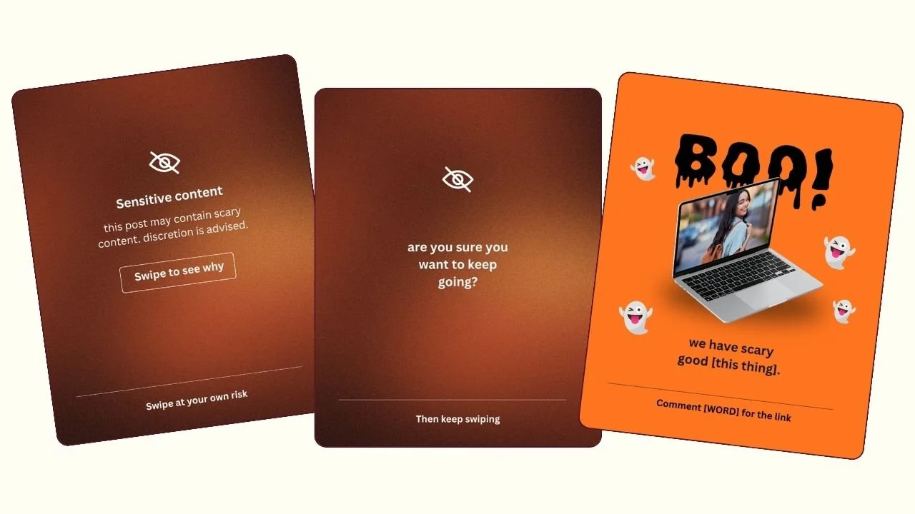
It's a playful parody of Instagram's sensitive content warning. The first slide says your post may contain scary content and that discretion is advised. The next slide asks if you're sure you want to keep going. Then comes the reveal: boo! We have scary good templates. Or scary good jewelry, scary good coaching, scary good social media management, whatever you sell.
There are cute little emojis along the way, which make the whole content warning meme even sweeter.
Why the sensitive content warning trend is working
We've all been trained to pause at that warning screen. It's Instagram's own design, so the Instagram sensitive content carousel gets an automatic double take. Asking "are you sure?" makes people curious enough to swipe. And because the payoff is a joke, nobody feels sold to, even though you just showed them exactly what you offer.
It's a Halloween Instagram post idea that works for almost any business, because the only thing that changes is the "scary good" line.
How to customize the Scary Content Warning Carousel in Canva
Fill in your offer on the reveal slide. If you sell products, "we have scary good" sounds most natural. If you're a service provider, try "we offer scary good" or name your service directly, like "our social media management is scary good."
You can change the colors, but keep them dark. If you want yellow instead of the original, pick a deeper, darker shade so it still looks like a warning screen. That's what makes the joke land.
Trend Four: Anti-AI Design Carousel
This one is going crazy viral right now. You've probably seen handwritten flyers popping up all over your feed, and this is our take on the anti-AI flyer, made manually, for you.
What the Anti-AI Design Carousel is
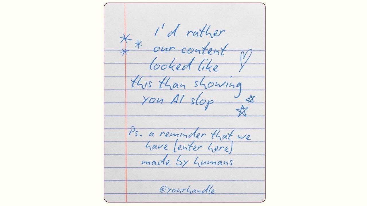
It looks like a handwritten flyer. It says, basically, that you'd rather your content look like this than show people AI slop, and it reminds your audience that what you make is made by humans. You fill in your product or service and your handle.
People have been writing these flyers by hand and taking photos of them, and you can absolutely do that too. But the font in this template looks so real that it saves you the step, and it gives you the idea even if you decide to write your own.
Why the made by humans trend is working
I'm not judging anyone for using AI for work. If anyone deserves tools that make life easier, it's small business owners. Everything shouldn't fall on us.
But AI design? It looks bad, and it's always the same. People are tired of scrolling past the same glossy, weird-handed graphics over and over. A handwritten sign in a feed full of AI slop is a breath of fresh air, and it tells people there's a real person behind your business.
This isn't a big statement for or against AI. It's just fun, and it's a sweet reminder to your clients that the things you give them were made by you.
How to customize the Anti-AI Design Carousel in Canva
Swap in what you make and your handle. That's it. Because the handwritten flyer trend already looks hand-lettered in the template, this human-made content post takes about a minute. If you'd rather go fully analog, grab a marker, write it on paper, and snap a photo.
Trend Five: How To Avoid Stress Meme
Let's end on the easy one. This is a funny relatable meme your audience will send to a friend before they even finish laughing.
What the How To Avoid Stress Meme is
The format is simple. "How to avoid stress at work. Don't go to work. Go to Paris." It's the go to Paris meme, and it's ridiculous in the best way.
Why the avoid stress meme is working
Everyone has a place that stresses them out. When you name the right one, people feel seen, and then they share it. That's what makes this how to avoid stress trend so good for sends, which is one of the best signals you can get on Instagram.

How to customize the How To Avoid Stress Meme in Canva
There are two ways to use this stress meme template, depending on what you sell.
If you're a service provider, think about where your audience gets stressed. Work, the in-laws, the holidays, parent teacher conferences. Then go for it. "How to avoid stress with your in-laws. Don't go to your in-laws. Go to Paris."
If you sell products, make your product the escape. "How to avoid stress at the family gathering. Don't go to the family gathering. Get yourself a new necklace instead." So cute.
Then drag in a photo of your product, a photo of you, or any stock photo you love.
Which Trend Should You Post First
Start with the Scrolling Story Interactive Carousel. The Instagram Story bounce is still trending, and this is your best promo of the week. If you have a sale, a launch, or a pile of great reviews, use it now.
Next, post the Wadded Paper Message Reel. The crumpled paper Reel is making the rounds right now, and Reels that ride a wave early get the most reach.
The Scary Content Warning Carousel has a hard deadline. It's a Halloween carousel, so it needs to go up before October 31. I'd post it in the last week or two before Halloween, when everyone is in the spooky mood.
The Anti-AI Design Carousel is riding a viral wave, so don't wait too long on this one either. The AI slop conversation is huge right now.
Hold the How To Avoid Stress Meme for a slower week. It's timeless, it's easy, and it's perfect for the day you have zero energy and still want to post something people will send.
If you are already inside Your Template Club, log in and grab this pack. If you have been thinking about joining, this week is a great time to see exactly what you get with every Trend Drop.
Trending Templates Released as Instagram Trends Emerge
When you join Your Template Club, you get access to Trend Drops — short, timely template packs inspired by the latest viral Instagram trends, so you can jump on trends early without spending hours figuring it out. We do the research, design, and strategy for you.


Photo: KVC Photography
About Manu Muraro
Manu Muraro is the founder of Your Social Team, a content marketing brand helping small business owners grow through strategic email marketing and Instagram content.
She’s the creator of Your Template Club, one of the first Canva template subscriptions designed for Instagram, and the founder of Your Inbox Team, a weekly email marketing membership that helps entrepreneurs send consistent, high-converting emails in under 15 minutes.
Manu is also the creator of The Reelies Awards, the first award show celebrating Small Business Owners and Creators’ creativity and originality in Instagram Reels.
A former creative strategist at Cartoon Network, Manu brings award-winning experience to everything she creates — from viral Reels to done-for-you content that saves time and drives results.
👉 Follow Manu at Your Social Team on Instagram