3 Ways to Get More Engagement on Your Static Instagram Posts
Getting engagement on Instagram can be a challenge, especially for static image posts that seem to get lost in the feed as your audience - and potential audience members - scroll right on by. But high-quality, attention-grabbing static posts are still an important part of your Instagram marketing strategy for your small business.
So let’s stop the scroll, and get you some more engagement.
Whether you want more likes, comments, saves or shares for your brand or business, these three engagement-boosting tips will soon have your Instagram numbers climbing.
What is the overall benefit of increasing Instagram engagement?
Before we dive into the engagement-boosting strategies, let's cover why Instagram engagement should be on your radar:
Reach More Users - High engagement signals to the Instagram algorithm that your content resonates. Instagram will show your posts to more new users which expands your reach.
Build Relationships - Likes, comments and shares lead to more meaningful connections with your target audience. Engagement helps foster brand loyalty.
Understand Your Audience - Seeing what resonates with them allows you to tailor content that better fits your audience's interests and needs.
Now that you know why you shouldn't ignore Instagram engagement, let's look at how to get more of it the RIGHT way!
Tip 1: Reuse Your Top Performing Instagram Images
One shortcut to better engagement? Repurpose what already works.
And the way to do this is to jump into your Instagram insights, directly in the app. Go through your Instagram posts over the past 3-6 months and take note of your top performers. The posts with the most likes, comments, saves and shares are clearly resonating with your audience.
You can breathe new life into these images and graphics by maximizing their value and reposting them. Get creative by editing the image to give it a fresh spin. You could:
Add new text quotes or graphics
Zoom in on a specific area and reframe it
Apply a trendy preset filter for a new look
Overlay it with an animation or visual effects
Or, you can simply repost the EXACT same image! This works exceptionally well for “introduction posts,” quotes that got a ton of engagement in the past, or images of your product that people really enjoyed seeing on the ‘gram.
Tip 2: Use a 4:5 Aspect Ratio for Standout Visuals
Most Instagram feeds are flooded with 1:1 squares. To stand out, go against the grain with a vertical 4:5 aspect ratio instead.
4:5 dimensions grab the eye better in the Instagram feed, giving your images an automatic edge. The extra vertical space also allows you to take up more real estate on someone’s phone. Let the image fill more of the screen to help stop them from scrolling past!
When designing Instagram content, assemble your visual elements in a 4:5 template right from the start. Use design apps like Canva that have pre-made templates so you don't have to do mental math to calculate the ratio.
If you already have a stunning 1:1 image you want to transform to 4:5, use an image resizing tool inside of Canva. Simply tweak the width/height to achieve the new dimensions without distortion.
Bonus: using this more vertical format, you have a better chance of “competing” with Reels that are seen as people scroll through their home feed!
Tip 3: Incorporate More Text in Your Photo
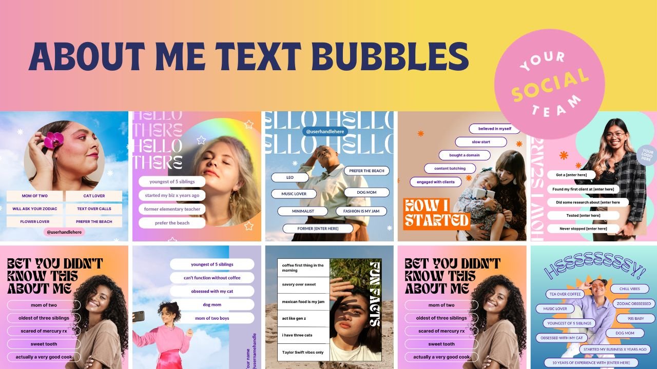
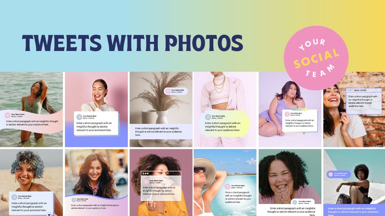
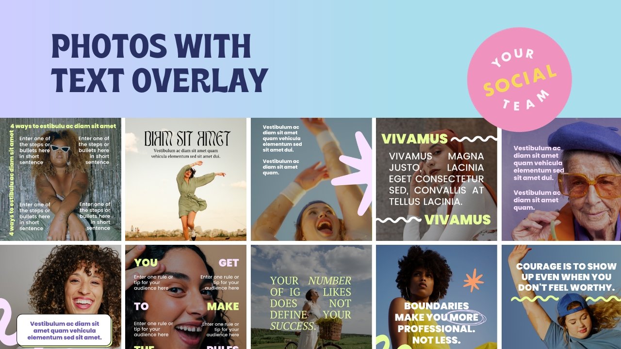
If you want to quickly boost Instagram engagement, add text to your static image posts. Words grab the eye and convey context better than a photo alone.
A BIG reason why your photos don’t get a ton of engagement all the time is because your audience can’t tell what the post is about (or what’s in it for them). So they are more likely to scroll right on past it.
You have lots of options when incorporating text:
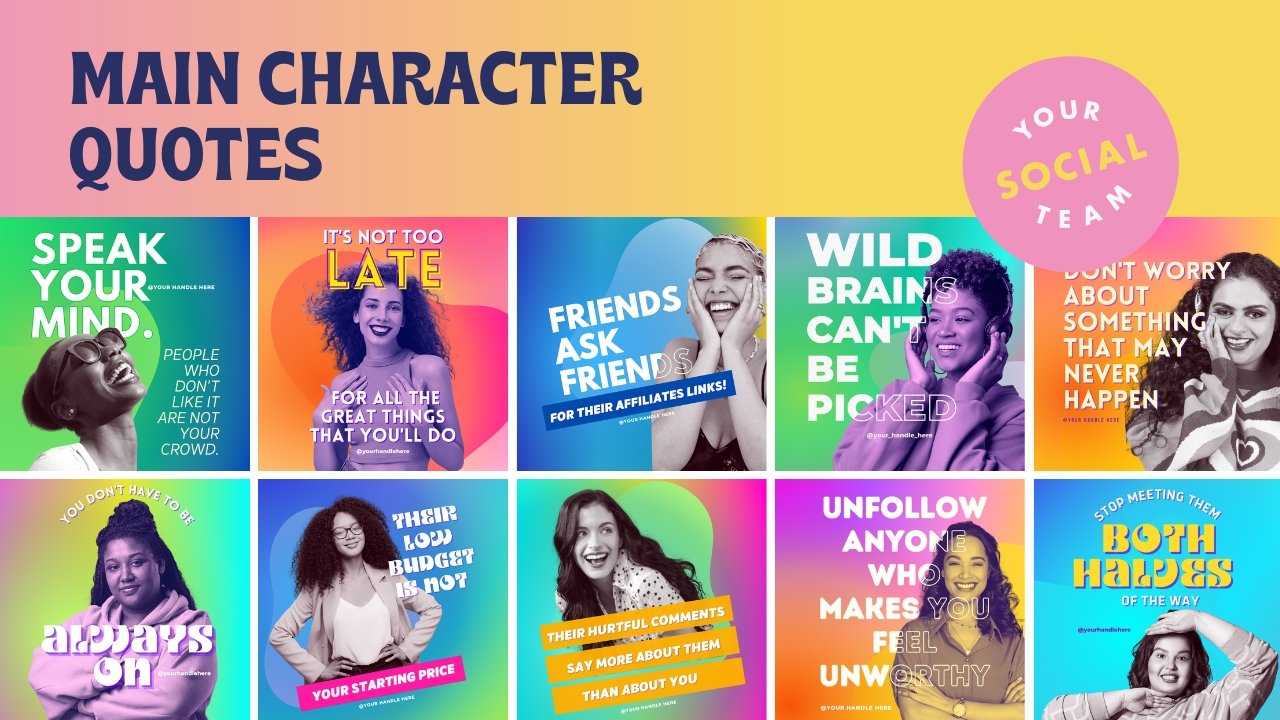
Quotes - Inspiring phrases resonate emotionally with viewers
Facts or Figures - Interesting stats and facts encourage sharing
Questions - Pose a thoughtful question to spark discussion
Calls-to-Action - Prompt viewers how to engage or take action
Titles - Creative text that ties the image to the caption below
Whatever text you add, make sure it:
Is large enough to read on a small screen
Uses a high-contrast color against the background
Balances text size if you have multiple elements
Aligns cleanly with the visuals in the image
Canva Templates to Level Up Your Static Instagram Post Engagement
Ready to REALLY boost your Instagram engagement on your static posts, and really stop your audience from scrolling right past your posts?
You can obviously implement these 3 tips - reusing top content, going 4:5, and adding text - and watch your likes, comments, and overall reach take off.
But, if you don’t want to have to design from scratch, reinvent the wheel, or worry about the strategy behind these tactics… we might just be able to help. We have a ton of Canva templates to help you increase your engagement here on Instagram!
Manu Muraro is the founder of Your Social Team, an Instagram training membership and content shop to help social media managers and Instagram savvy women entrepreneurs to beat the algorithm and grow their organic engagement (yes, even in 2021).
This year she also launched Your Template Club, a Canva Template subscription to provide social media managers and Instagram savvy business owners with content templates designed for engagement in their inbox.
Born and raised in Brazil, Manu moved to the U.S. in 2000 right out of college to work for Cartoon Network, where she made an award winning career in creative and strategy. In 2017, Manu started Your Social Team with the mission of helping women entrepreneurs and social media managers grow engagement and sales through Instagram without the overwhelm.


