
The Ultimate Instagram Sizing Guide for 2026: Feed Posts, Reels, New Grids Size & Banners
BEFORE WE START:
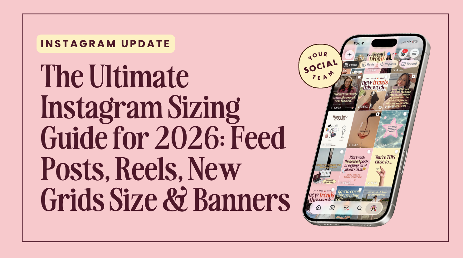
Updated July 2026 ✍🏽 Bookmark this page so you always have Access to the Correct Instagram content sizes and dimensions that will work for the new Instagram Grid Size and avoid your content getting cropped.
What's New in 2026
Instagram's grid keeps evolving, and there are now two different "correct" sizes depending on what you're making, and mixing them up is the #1 reason creators still see weird cropping.
Here's the deal in one sentence: use 1080 × 1350 for everyday feed posts and carousels, but use 1080 × 1440 if you're building a seamless multi-post banner or puzzle for your grid.
Let's break down exactly why, plus everything else that's changed since our last update.
Quick Refresher: Why Did Instagram's Grid Change At All?
If you're catching up, here's the short version. Instagram moved away from the classic 1:1 square grid because, according to Adam Mosseri (Head of Instagram), the vast majority of content posted is not actually square — it's Reels, 4:5 posts, and vertical video. Keeping the grid square meant a ton of content was getting cropped in the preview (hello, foreheads cut off in Reels covers).
So Instagram shifted the grid to a taller ratio to better reflect the content people actually post. That shift has continued to evolve since 2025, and by 2026 it's settled into a clean, standardized 3:4 tile at 1080 × 1440 px — which is what we'll cover below.
1. The Exact New Grid Size (No More Cropping)
The Instagram profile grid now previews content at a 3:4 ratio — precisely 1080 × 1440 px. This is the true, uncropped tile size Instagram uses to render your grid.
Grid tile size: 1080 × 1440 px (3:4)
This is not the same as the old 1013 × 1350 preview ratio from 2025 — Instagram has since standardized the grid at the cleaner 1080 × 1440.
⚠️ But here's the catch: use it selectively - or only If You post manually
Even though 1080 × 1440 is technically supported as an upload size now, most third-party schedulers don't fully support it yet. If you schedule content in 1080 × 1440 through a tool that isn't updated, you risk it getting auto-cropped back down on export.
Our recommendation for regular content: keep creating standard feed posts and carousels at 1080 × 1350 px (4:5). It's stable, universally supported by every scheduler, and the visual difference in the grid is minimal. We'll keep our templates at this size until scheduler support catches up industry-wide.
Where you SHOULD use 1080 × 1440: if you're building a banner or billboard-style grid — meaning a single wide design split across 3, 6, or 9 posts side-by-side purely for visual effect on your profile. Since these are designed specifically to be viewed as a grid (not as individual feed posts), you want them sized to Instagram's actual grid tile — 1080 × 1440 — so each piece lines up perfectly without the old white-padding workaround.
📌 This does NOT apply to carousels. Only the first slide of a carousel ever appears in the grid preview, so carousels should stay at 1080 × 1350 like normal — no need to size every slide for the grid.
2. Scheduler Support in 2026: What Actually Works
Since scheduler compatibility is the biggest catch here, we tested and researched how the major tools currently handle the new 1080 × 1440 size. This will keep changing, so treat it as a snapshot rather than gospel — but here's where things stand:
Scheduler1080 × 1350 (Feed)1080 × 1440 (Grid Banner)NotesInstagram (native app)✅ Full support✅ Full supportAlways the most reliable option for new sizesLater✅ Full support⚠️ Partial/inconsistentMay auto-crop 1440 uploads — test before a launchBuffer✅ Full support⚠️ Partial/inconsistentSimilar cropping risk on non-standard sizesMetricool✅ Full support⚠️ Rolling outSome accounts have early access, not universal yetPlanoly✅ Full support❌ Not yet supportedDefaults to legacy dimensions
Bottom line: if you're posting a grid banner or puzzle, we recommend uploading directly through the Instagram app rather than trusting your scheduler — at least until you've confirmed your specific tool handles 1080 × 1440 cleanly.
3. Full 2026 Instagram Sizing Cheat Sheet
Content TypeSizeRatioNotesFeed Posts & Carousels (recommended)1080 × 1350 px4:5Universal scheduler support, use for all regular postsGrid-only Banners/Puzzles1080 × 1440 px per tile3:4Use ONLY for seamless multi-post grid bannersSquare Posts (legacy)1080 × 1080 px1:1Still works, but grid crops it into 3:4Stories, Reels, Lives, Covers1080 × 1920 px9:16Standard vertical full-screenCinematic/Letterbox Reels (trend)5120 × 1080 pxUltra-wideNot officially supported, but trending hard — moody, cinematic B-roll look
4. How to Build a Seamless Grid Banner or Puzzle in 2026

Here are the correct sizes for banners and static grids for Instagram in 2026
Want that scroll-stopping look where one big image or design is split perfectly across several grid tiles? Here's the updated method — and good news, since Instagram's grid tile is now a clean 1080 × 1440, you no longer need the old white-padding workaround. Just size and split your design directly.
Updated Canvas Sizes for Splitting (based on 1080 × 1440 tiles)
3-part banner: 3240 × 1440 px (1 row × 3 columns)
6-part banner: 3240 × 2880 px (2 rows × 3 columns)
9-part banner: 3240 × 4320 px (3 rows × 3 columns)
12-part banner: 3240 × 5760 px (4 rows × 3 columns)
Step-by-Step TO CREATE INSTAGRAM BANNERS and SATTIC GRIDS in Canva or ADOBE EXPRESS in 2026
Create your project at the size matching how many posts you want (see above).
Design your full image — photo, launch graphic, or brand banner — across the entire canvas.
Open Canva's Image Splitter app (Apps → search "Image Splitter").
Select your design, set columns to 3, and set rows based on your layout (1 for 3-part, 2 for 6-part, 3 for 9-part, 4 for 12-part).
Click Split Image, then save each piece to your uploads.
Post each tile at its native 1080 × 1440 size — no need to center it inside a padded 1080 × 1350 box anymore, since this is your actual grid tile size.
Post in reverse order — start with the bottom-right tile and work backward, so the grid displays correctly once all pieces are up. For a 9-part grid: Row 3 (right→left), then Row 2, then Row 1.
When should you actually use a grid banner?
Grid banners work best for high-attention moments, not everyday posting.
Launch week for a new product, course, or offer
New account setup — pinning a branded welcome banner to the top of your grid
Milestone announcements — anniversaries, rebrand reveals, big wins
Events — countdowns to a live, drop, or collab
They're not meant to be a permanent grid style — think of them as a temporary "billboard" moment, then swap back to regular posts once the moment has passed.
⚠️ Important limitation to flag
Because most schedulers still cap uploads at 1080 × 1350, you may need to post banner tiles natively through the Instagram app rather than through your scheduler until support catches up. Worth testing your specific scheduler first — some have started rolling out 1080 × 1440 support.

5. Best Practices for 2026

Default to 1080 × 1350 for all standard feed posts and carousels — it's still the safest, most compatible choice. If you create templates or content for others, always use this format.
Reserve 1080 × 1440 specifically for grid banners/puzzles meant to be viewed as a cohesive multi-post visual or if you only post manually.
No need to resize carousels for the taller (newish) grid — only slide 1 ever shows in the grid preview.
Center key text/elements in the middle "square" zone of any design, since some users on older app versions may still see square-cropped previews.
Leave a little padding around the edges of feed designs to avoid awkward crops on the grid thumbnail.
Test your scheduler before a big launch. If you're planning a grid banner moment, do a dry run a few days early rather than discovering a cropping issue the morning of.
Don't panic about old square posts — Instagram isn't going to punish your existing grid. Everyone's profile is adjusting at the same pace, and most followers won't even notice a "mismatched" grid. It’s better to use your time and energy into creating new content more people will see.
FAQ
Q: Should I switch all my content to 1080 × 1440 now that it's the "real" grid size?
No, you can stick with 1080 × 1350 for everyday posts and carousels. Save 1080 × 1440 for banner/puzzle-style grid content specifically.
Q: Do I need the white-padding trick for grid puzzles anymore?
No. Since Instagram's actual grid tile is now 1080 × 1440, you can size and split your banner directly at that size — no padding workaround needed.
Q: What about carousels — do I need to resize every slide?
No. Only the cover slide shows in the grid, so keep carousels at 1080 × 1350 as usual.
Q: Will my scheduler crop my grid banner posts?
Possibly, depending on the tool — see the scheduler comparison table above. When in doubt, post banner tiles directly through the Instagram app.
Q: Is the 5120×1080 cinematic Reels format official?
Not officially supported by Instagram, but it's a strong ongoing trend worth testing for scroll-stopping hooks.
Q: How often should I use a grid banner?
Sparingly — treat it as a special-occasion tool for launches, milestones, or new account setup, not a permanent grid style.
Want plug-and-play templates already sized for both feed and grid-banner formats?
Your Template Club keeps every size updated as Instagram evolves so you never have to do the math yourself.
TRY A FEW OF OUR TREND CANVA TEMPLATES FOR FREE
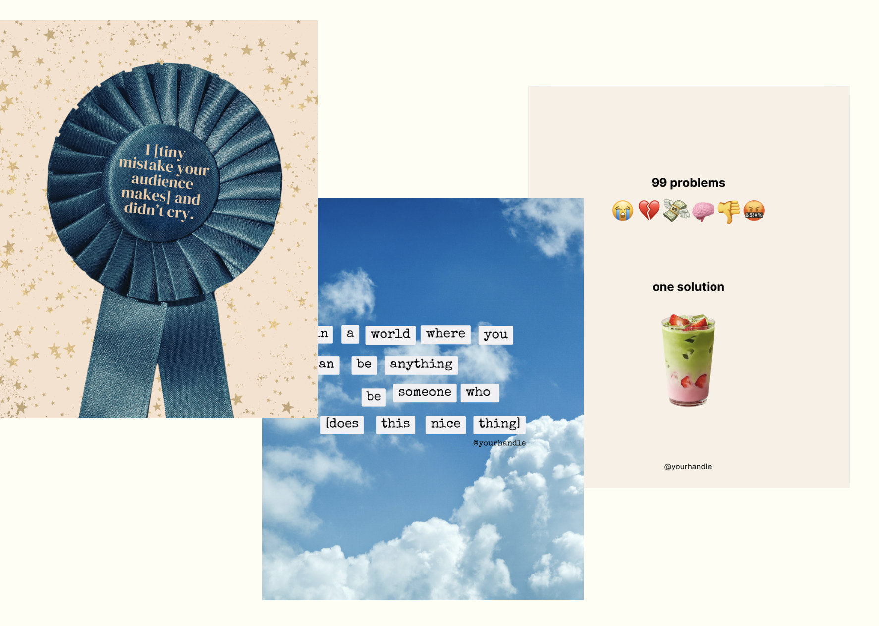
These visual trends have been out-performing Reels and take 5 minutes to create with our templates!
🎬 Bonus: The “Skinny” Cinematic Reels TRenD Format (5120×1080)
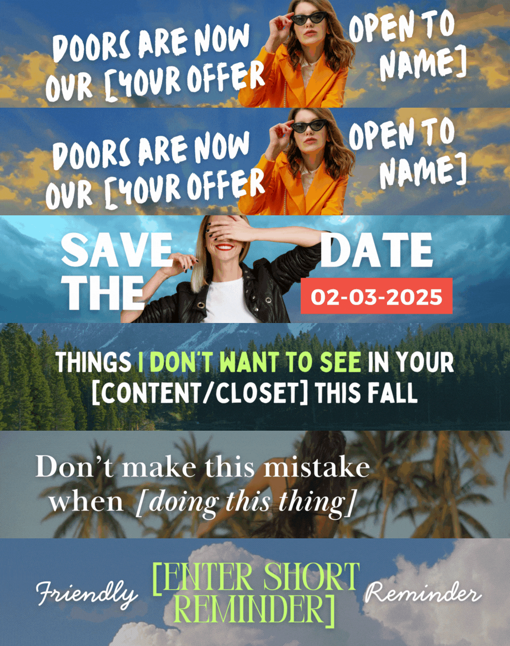
Tap the image to get these skinny reels templates
Brands and creators use this ultra-wide 5120 × 1080 reels format for bold, movie-trailer-style hooks that stand out from typical vertical scrolling. It's unofficial (Instagram doesn't natively "support" it), but the engagement has been strong enough that it's worth testing, especially for hook-driven content.
💡 These are sometimes called letterbox Reels, thin Reels, or the “thinnest post” trend, and while they’re non-traditional, they can definietely be scroll-stopping.
They work because:
👉 They interrupt the usual vertical-scroll format
👉 They look elevated and cinematic
👉 They invite curiosity, which leads to higher engagement (especially when paired with a strong hook)
Just one catch: many people are posting them with cropped text or unreadable overlays.
Want more Instagram tips? Follow @YourSocialTeam for the latest updates and insights tailored for creators and entrepreneurs.

Manu Muraro is the founder of Your Social Team, an Instagram training business and content shop to help social media managers and Instagram savvy women entrepreneurs to beat the algorithm and grow their organic engagement (yes, even in 2021).
She also launched Your Template Club, a Canva Template subscription to provide social media content templates designed for engagement, and Your Inbox Team, a email marketing templates membership.
In 2024 Manu also launched the first ever Reels Award Show, The Reelies Awards, created to recognize small entrepreneurs. Check it out and get involved.