
Canva Font Combos That Make Your Brand Look Like You Hired a Designer

Picking fonts in Canva is one of those things that sounds simple until you are forty-five minutes deep, you have tested eleven combinations, and your design somehow looks worse than when you opened it.
You are not doing anything wrong. You just do not have a system yet.
Because fonts are not just a vibe choice. They communicate your brand personality before someone reads a single word. The right combination makes your content feel cohesive and intentional. The wrong one, or too many of them, makes even a great post feel a little chaotic.
The good news is that you do not need a design degree to get this right. You need a structure and a starting point. Here is both.
How Many Fonts Does Your Brand Actually Need?
Three. That is it:
One header font that is bold and grabs attention.
One subheader font that adds a little personality and supports the header.
One body font that is simple and easy to read without thinking about it.
Each font has a job. They do not overlap, they do not compete, and you do not need anything else. When every post follows this same structure, your content starts to feel cohesive across Instagram, emails, and anywhere else you show up.
The biggest font mistake DIY brands make is not picking bad fonts. It is using too many. When every post has a different style, your brand becomes harder to recognize, and recognition is what builds trust. Pick a combination and commit to it.
5 Canva Font Combos You Can Use Right Now
All of these are available inside Canva with no uploading or extra steps required. Pick the one that matches your brand energy and start using it everywhere.
Bold and Modern: This combo is clean, confident, and easy to read at any size. It works really well if your brand is direct and straightforward, the kind of content that gets to the point fast and does not overthink it. Great for business-focused content, educational posts, and anything where clarity is the priority.
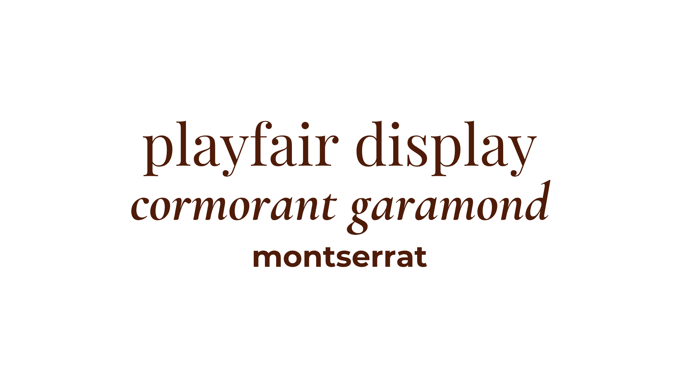
Soft and Elevated: This one feels more editorial and feminine without sacrificing readability. The serif headers give it a polished, high-end feel and the Montserrat body keeps everything grounded and easy to skim. If you are a coach, creative, or personal brand with a warmer and more refined aesthetic, this is a great fit.
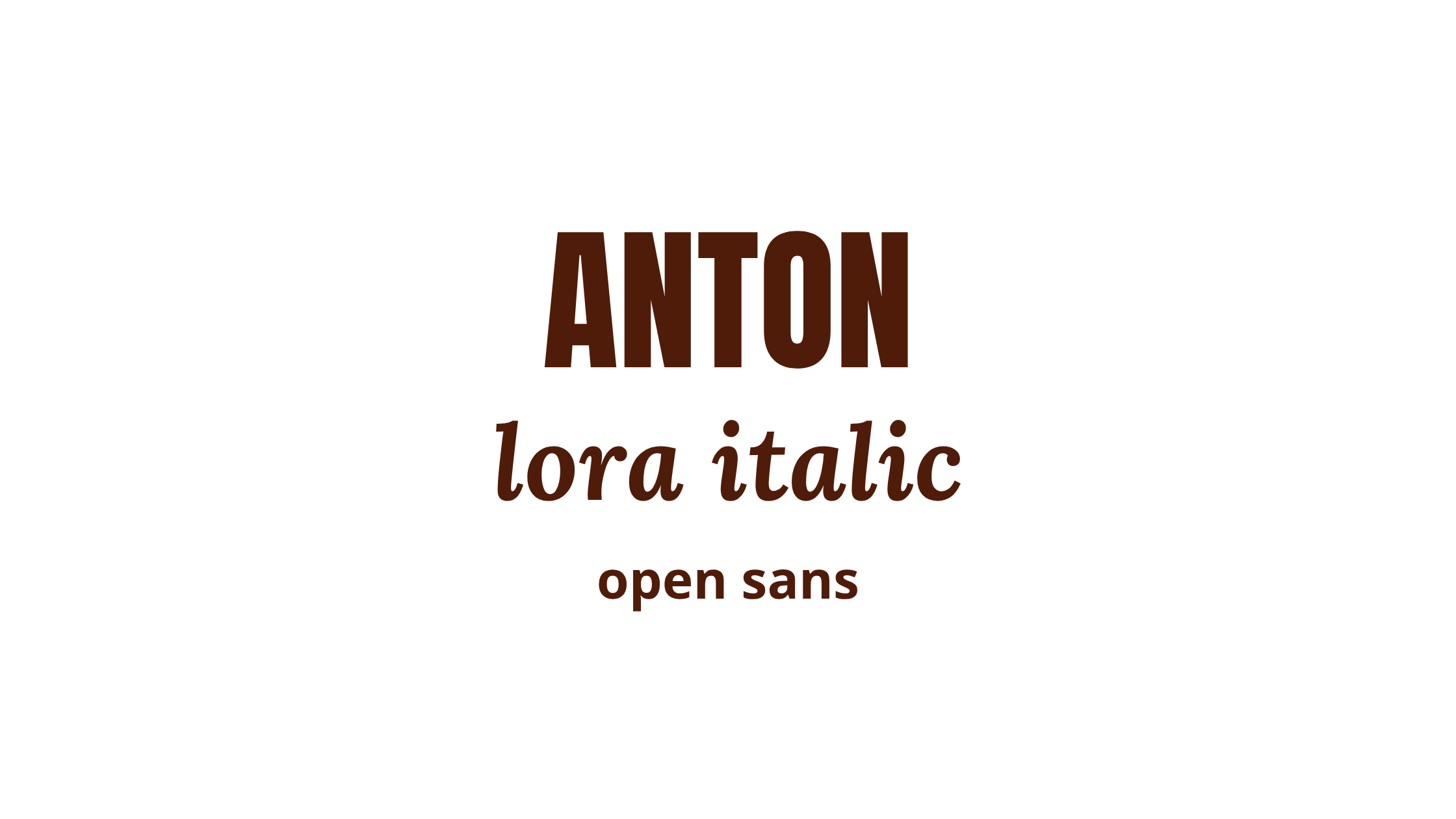
Minimal and Neutral: This combination is for the person who wants their brand to feel clean and understated. It has a quiet confidence to it, nothing flashy, nothing trying too hard. If your aesthetic leans toward simple and modern, this one reads as intentional without demanding attention.
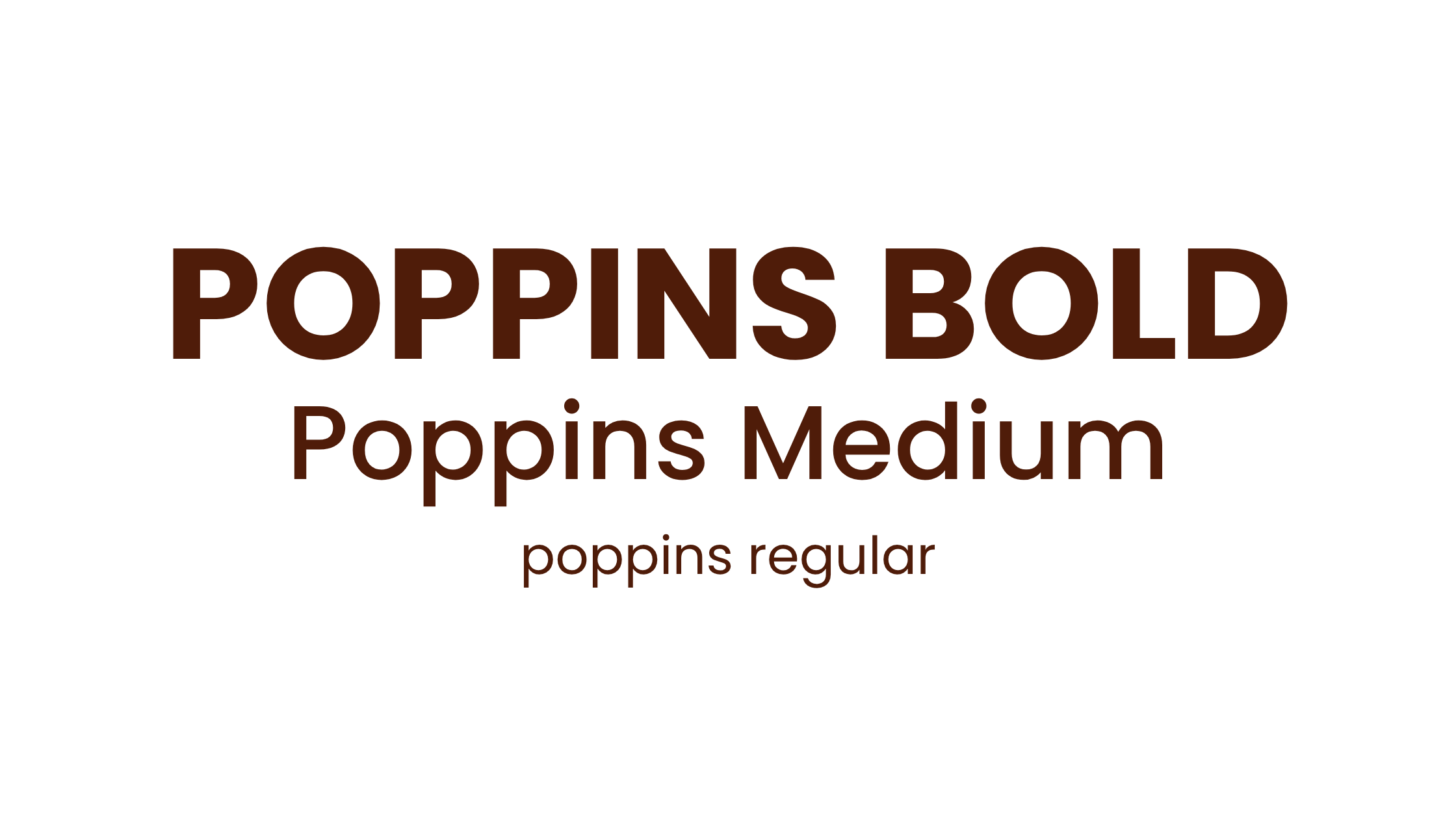
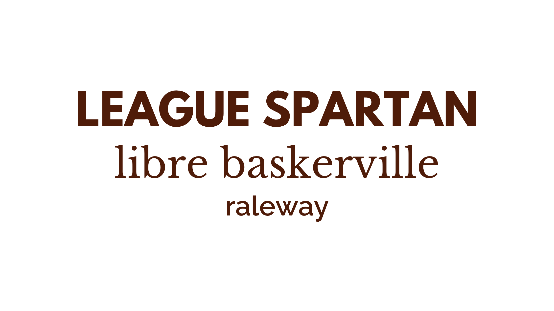
Friendly and Modern: Yes, you can use one font family and yes, it works beautifully. Using different weights of the same font creates a super cohesive look with almost no effort. This is a great option if you want a minimal, approachable brand that feels consistent without a lot of decisions to manage.
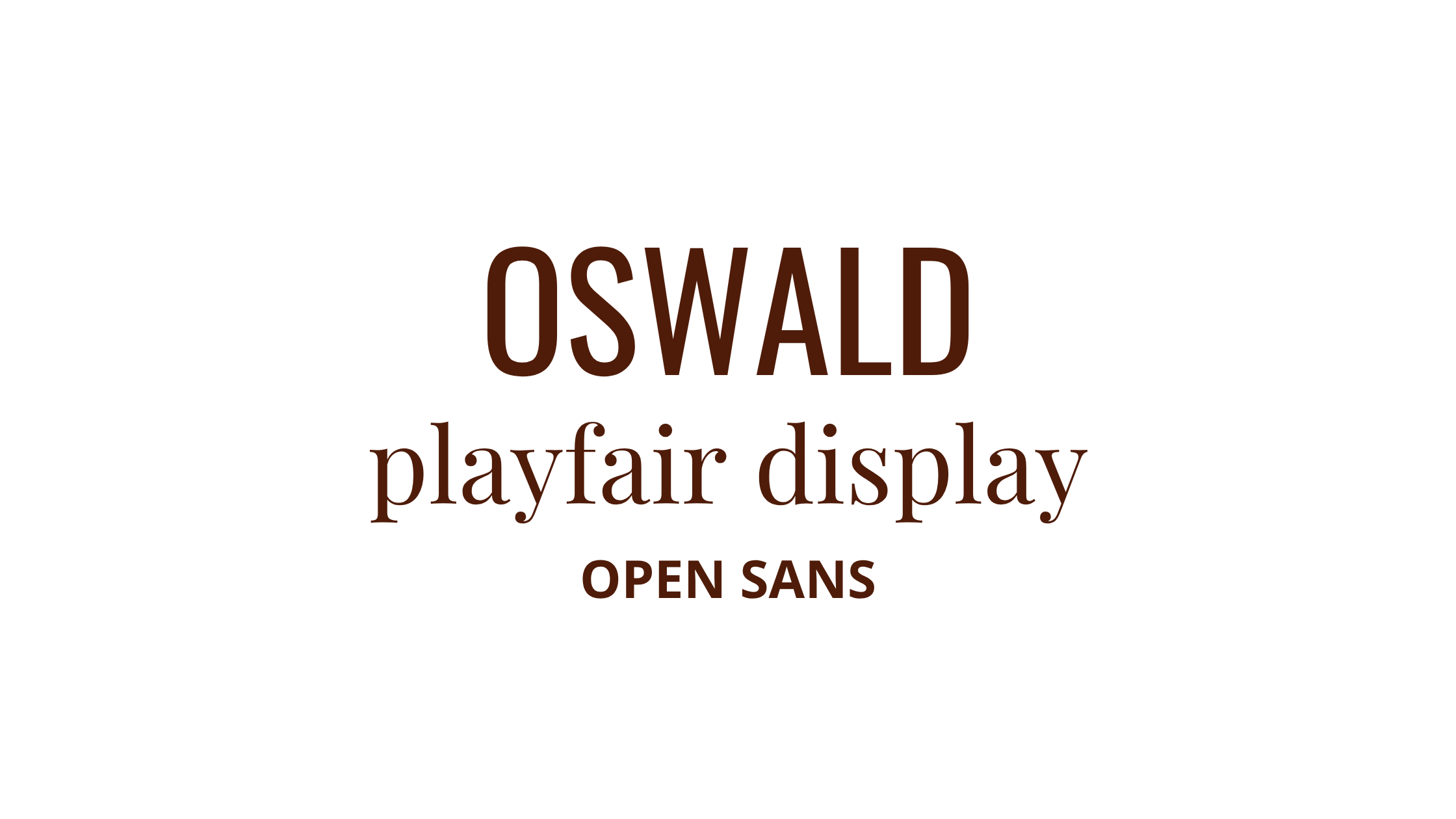
Creative but Still Polished: This combo gives you structure with a little personality. Oswald is strong and direct at the top, Playfair Display adds a stylish contrast in the middle, and Open Sans keeps the body clean and readable. It is a solid middle ground if you want your brand to feel confident but not stiff.
How to Know If a Combo Is Working
Before you commit to a font combination, run it through this quick gut check.
Can you read it easily on your phone at the size you actually use it? Does it feel balanced, like the fonts are working together instead of competing for attention? And honestly, could you see yourself using this same combination consistently for the next few months without getting bored of it?
If yes to all three, you found your combo. If something feels off, simplify. When in doubt, go more neutral with the body font and let the header do the personality work.
Want to see our favorite Canva fonts?
After creating thousands of Canva templates, designing thousands of Instagram posts, and now as we start to help small business owners create a brand they love, we have quite the collection of Canva fonts for you to dive into!
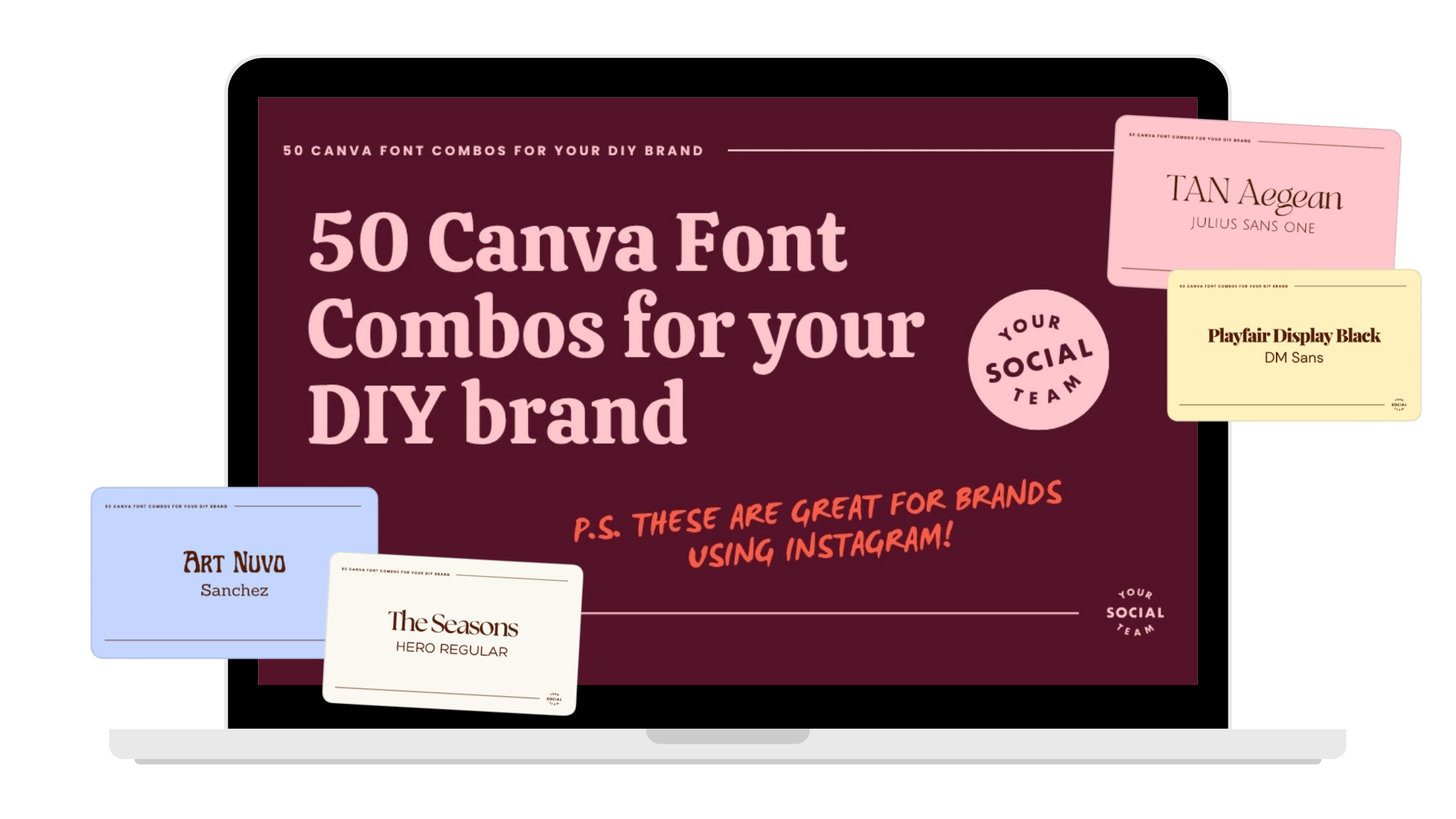

Photo: KVC Photography
About Manu Muraro
Manu Muraro is the founder of Your Social Team, a content marketing brand helping small business owners grow through strategic email marketing and Instagram content.
She’s the creator of Your Template Club, one of the first Canva template subscriptions designed for Instagram, and the founder of Your Inbox Team, a weekly email marketing membership that helps entrepreneurs send consistent, high-converting emails in under 15 minutes.
Manu is also the creator of The Reelies Awards, the first award show celebrating Small Business Owners and Creators’ creativity and originality in Instagram Reels.
A former creative strategist at Cartoon Network, Manu brings award-winning experience to everything she creates — from viral Reels to done-for-you content that saves time and drives results.
👉 Follow Manu at Your Social Team on Instagram