New Updated Instagram Sizing Guide (July 2022) - Use these sizes when creating and posting on Instagram
***UPDATE: Instagram is no longer testing the vertical feed scroll, but these sizes below are still what we recommend.
You will want to bookmark this blog post, especially if you’re a social media manager or someone who created a lot of content for Instagram!
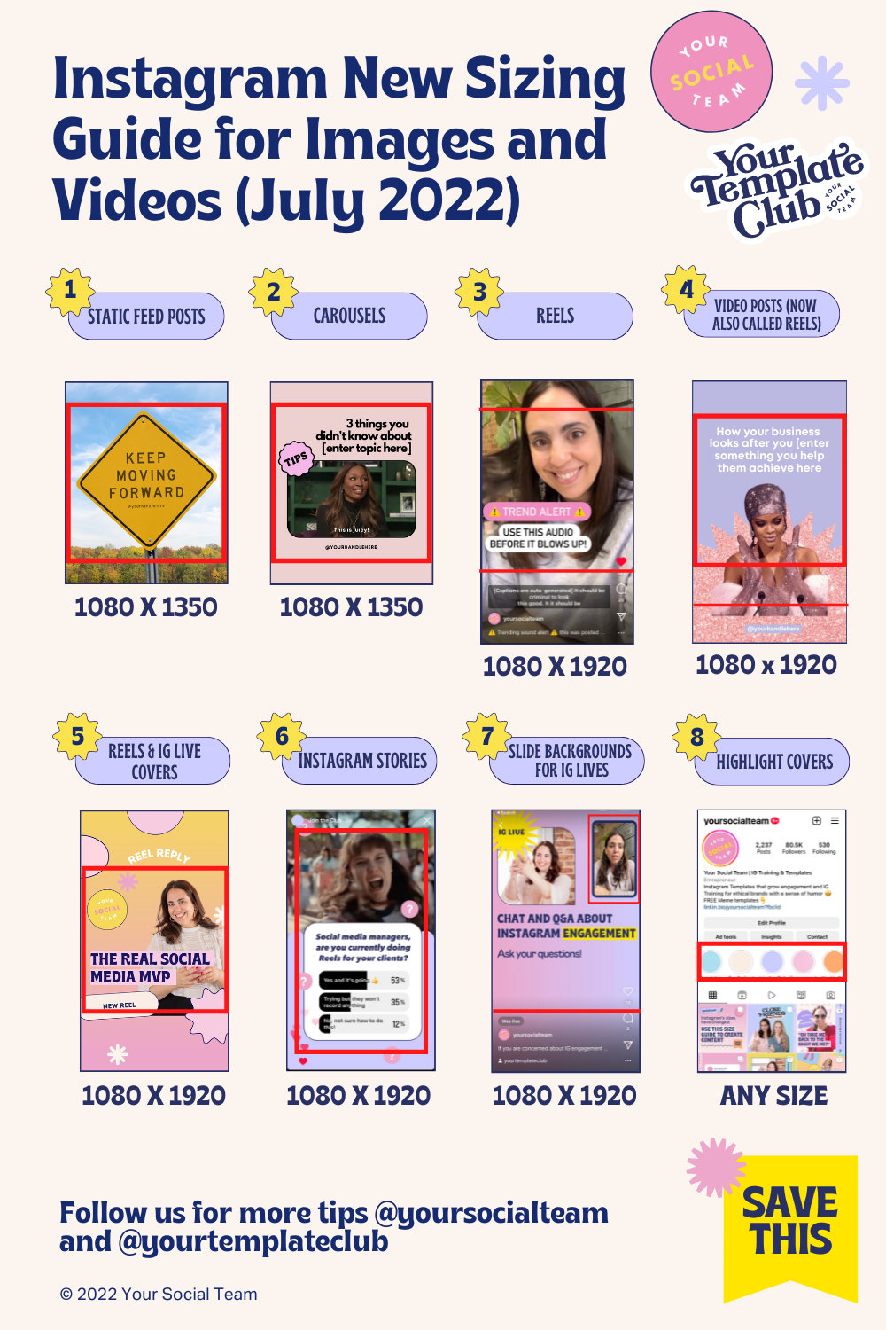
Before we start, please go ahead and save the image below for your records.
The red lines are your safety zones.
Pro tip: print it and put it up in your desk to use when creating content!
The most complete Instagram size guidelines you will find on the internet - updated according to Instagram and video changes in July 2022
This is what you will find in this blog post:
The Most Complete Instagram Size Guidelines Ever (I am not exaggerating!) image for your records (above)
A list of all Instagram Features and content formats with the pixels size and aspect ratio, along with details that can make or break your engagement — no one can engage with a Reel with overlapped text and captions that no one can read, am I right?
An explanation of what has changed on Instagram and why we are now recommending these formats (you may be tempted to skip, but i highly recommend you read and understand, especially if you’re a social media manager or content creator!
So let’s start, shall we?
New Updated Instagram Sizing Guide (July 2022) - Use these sizes when creating and posting on Instagram
Here’s a list of every Instagram feature and format you need to know to have content that looks easy to see and professional:
1) STATIC FEED POSTS
All static feed posts should now be 4:5 ratio, or 1080 x 1350 pixels, with all important text and imagery in the center square.
This includes any image, photo or graphics.
Important to note that many people have already adopted this format for their posts and many Instagram coaches have been suggesting it.
The reason I am not one of them, is because I felt there was no reason to do it until now. In fact, in my opinion, there was more reasons not to do it.
First because if you used the whole space in 4:5 posts, your graphics would be cut off in our grids, which until recently, everyone has square grid views.
Now if we did longer posts without adding any information to the top and bottom, we would be just wasting space. But my two biggest reason not to start posting 4:5 posts until now are:
longer posts in the scroll, means longer scroll. So potentially everyone would get lower engagement, since people would need to scroll longer to see the same amount of posts they see now.
OR people would start scrolling longer than they have already been to see all posts. This would not be good for anyone’s mental health and protect our collective mental health as it relates to social media, is very important to my business mission.
2) VIDEO FEED POSTS
Instagram announced all video posts will now be Reels - time to start posting video posts full screen - with all important text and imagery in the center square for the feed.
Includes any posts with animated elements such as GIFs, moving video backgrounds, animated graphics from Canva or any other design apps, and more.
While you can still post videos 4:5 or 1080 x 1350 sizing, posting them automatically as Reels is also now allowed through Facebook studio or official partner scheduling apps, like Later, Planoly, Sprout Social, Hootsuite, Plann, Buffer, Flick, Canva and so many more.
You can also post 9:16 videos as Reels manually if you want to add trending sounds!
3) CAROUSELS
Carousels should should be 4:5 ratio, or 1080 x 1350 pixels, with all important text and imagery in the center square only for the first page.
Only the first page will show in the profile grid, that’s why we don’t need to worry about the square in other pages.
Even if your Carousels include video, they can’t be full screen, because full screen videos can’t be posted as Carousels.
4) INSTAGRAM REELS
Reels are still 9:16 ratio, or 1080 x 1920 pixels. But text placement had changed!
Instagram added automated captions for the sounds of Reels, which is great to save us work from typing it all out and also tricky because some of us have this feature and some don’t.
Make sure you place all text above the red line so it doesn't overlap with the automated captions (even if you don't have auto-captions, others who do may see it).
5) COVERS FOR REELS AND INSTAGRAM LIVES
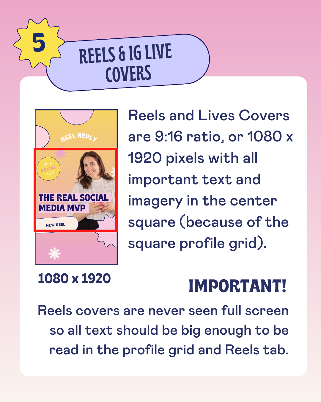
Reels and Lives Covers are 9:16 ratio, or 1080 x 1920 pixels with all important text and imagery in the center square.
As a reminder, we keep mentioning considering the square center of your images and this is no exception.
This is because even though Instagram is moving towards 4:5 grids in profiles, most people still have square feeds, so we need to cover both bases.
6) INSTAGRAM STORIES
Instagram Stories are 9:16 ratio, or 1080 x 1920.
It’s best practice not to add any information too close to the edges.
As you move your elements inside stories and get too close to the edges.
We should also remember not to add any clickable items, such as stickers and tags too close to the edges, or they won't be clickable.
7) SLIDE BACKGROUNDS FOR INSTAGRAM LIVES
Slides Backgrounds for IG Lives (only available for iPhone) are 9:16 ratio, or 1080 x 1920.
But there’s very important layout info you should know!
Your camera will be on the top right and people's comments on the bottom, so avoid those areas.
Any text automatically added by Instagram like your handle, the title of your live as well as notifications when people join, their comments and IG icons are all in white, so avoid light colors on the bottom part, otherwise you will not be able to see it during your live.
By the way this is my absolute favorite underrated Instagram feature, so if you have an iPhone, make sure you learn about it here!
8) HIGHLIGHT COVERS
Highlight Covers can be any size you want, as long as you have the information contained in a circle.
We actually recommend very simple designs or just plain colors for your Highlight covers, since the grid already has enough visual information.
Want to try out templates in this new format? Click here to get 10 1080 x 1350 FREE Canva templates for Instagram!
Having content properly sized will help you get engagement and leave a good first impression in any of your profile visitors, which includes potential clients and customers.
Now here’s the background info, so you understand the changes that are happening on Instagram as it comes to video content and formats:
As we know, Instagram is always changing (Thanks, Mosseri!)!
To be honest, I am one of the only people who enjoy the constant changes and don’t feel or recommend that we all need to act RIGHT AWAY every time there is any change or new Instagram feature announced.
But this latest one impact how your content is viewed and you may not even realize it. So it’s very important for anyone who uses Instagram to learn what’s happening and adapt the sizes of your content, especially those of us using it to market and promote our business or creators accounts!
So here we go:
Instagram is shifting towards vertical content and testing a 4:5 ratio grid in profiles. This new 4:5 grid that many people already have today, crops both sides of our square posts to fit in this “taller” format. People who has this new layout in their Instagram accounts, will view every grids from every profile they visit in this 1080x1350 format (yes, including yours and mine!)
This means many of our followers may be seeing our images, graphics and text cut off when they visit our profiles — and this includes new potential clients!
Preview of the new 4:5 grid that many of your followers already see on Instagram - Screenshot of Reel by Later
You can see a preview of this new grid in this screenshot my feed (courtesy of @bloomsocialstudio) and how the images are cropped on the sides for the only 3 square images I have there. All the rest that look nice are Reels or already 4:5.
Check out the the 3rd post in the 3rd row to see how the text has been cropped.
Even though we can guess what it’s saying for the most part, this view of this grid does not look professional or something we work so hard for!
So use the guidelines in this blog post to create content moving forward!
For more tips and strategies to help you use Instagram to grow your business, follow us on… you guessed it, instagram @yoursocialteam
Don’t want to worry about Instagram size changes or new features ever again?
our templates will keep you ahead of the trends and if instagram has changes, we will change with it — you just focus on your message and what you sell!
Manu Muraro is the founder of Your Social Team, an Instagram training membership and content shop to help social media managers and Instagram savvy women entrepreneurs to beat the algorithm and grow their organic engagement (yes, even in 2021).
This year she also launched Your Template Club, a Canva Template subscription to provide social media managers and Instagram savvy business owners with content templates designed for engagement in their inbox.
Born and raised in Brazil, Manu moved to the U.S. in 2000 right out of college to work for Cartoon Network, where she made an award winning career in creative and strategy. In 2017, Manu started Your Social Team with the mission of helping women entrepreneurs and social media managers grow engagement and sales through Instagram without the overwhelm.

