Should I use a cover for my Instagram Reel or will that lower my engagement?
Recently my friend Natasha from Shine with Natasha invited me to speak at her podcast about Reels Covers. I thought, what a fun topic to talk about in the blog too!
First, I think it’s important to clear this up: there’s no indication that by using a cover you will get less engagement in your Reel. On the contrary.
There’s a rumor that has been echoed, or maybe even started, by a renowned Instagram coach, saying that Reels with cover don’t perform well.
We asked David and here’s what he had to say:
There has been no indication or information that suggests that this is the case. Funny enough, the same person who said this, does use covers for their Reel, they are just not designed in Canva.
Instagram actually added a button to allow you to edit or add a Reel cover after the Reel has been posted, which was not available when the Reel feature was launched. Why would they do this if they didn’t want you to add covers or if covers lowered reach?
Most rumors that don’t make sense aren’t true.
Should I use a cover for my Instagram Reel or will that lower my engagement?
“When it comes to Instagram rumors, we need to use common sense first. Instagram themselves added the feature that allows you to add a cover to your Reels. Why in the world would their algorithm “punish” anyone for using a feature they created themselves? Wouldn’t it be easier for them to remove the feature? (Yes, it would)”
Instagram recently added a feature to edit in Reels, allowing you to replace or add a cover to your Reel. Do you really think Instagram would bother to add this feature if covers lowers engagement or were frowned upon by the Instagram algorithm?
You may be thinking “of course she is saying covers are good, she sells cover templates”. It’s actually the opposite: I created Canva templates for Reels Covers to add to my template shop because I think they are a great idea.
But what are the benefits of using a designed cover for your Instagram Reels?
More views - By adding the title or topic of your Reel to the cover, you let people who are browsing through your feed and Reels tab know right away what’s inside that Reel, which will not only attract more people to your Reel, but also the right people for that content
Branding - if you add covers that are well designs with your brand colors and photos, you have another chance to reinforce your brand and make it more recognizable
Aesthetics - covers make your feed and your Reels tab look so nice. Just check out ours below from our two accounts.
Reels membership we love and recommend:
You will get the direct link to 4 trending audios for Reels per week, with a simple explanation on how to use it, so you can click on your audios of choice and start recording! I am a member and love it. By opening their emails and clicking on the links, I can record 3 Reels in 15 minutes!
Pro tips to create perfect covers for Instagram Reels in Canva or any other design platforms:
Here are three important things to consider as you’re designing your Reels Covers, which I will explain:
The Title
The square
The Reels logo on your grid
1) The Title
One of the biggest advantages of using Reels Covers is to be able to add an easy-to-read title that your audience can read when they are looking at the grid on your profile — yes, I said GRID. This means your title needs to be bold enough, big enough and have enough contrast in colors so someone can read it in a tiny square as they look at all your posts side by side.
For that reason, you should not add a bunch of text, just the main title. Make sure your title ties into something that adds value to your audience or that they can relate to and think “this is for me”.
For example: if I am creating a Reel to sell my templates, instead of saying “Buy my templates”, my title could be “If you need to grow Instagram engagement”.
Sometimes I also add something that says NEW REEL or Canva Tip for example. A little something to make the design more interesting and reinforce that it’s something worth looking at.
But adding a paragraph or any more text is a waste of space and it will not be readable, because when you open that Reel, you will not be able to see the cover and read what’s there. The Reel will just play.
2) The Square
Since more people look at your profile grid, where all your posts are shown side by side, than your Reels tab, we need to prioritize the square as we design our Reels covers.
So whether your cover is just a screenshot of one of the images inside the Reel with text overlays (ie. text on top of the image) or something more designed, like our Covers Templates below, it’s very important to keep all your information in the center square. Anything else will be cropped out when someone looks at all posts in your Instagram profile.
If you’re designing in Canva, you have to start an Instagram Story file, since Canva doesn’t have a Reels Cover option (which is surprising!).
Then I recommend you start designing with your text, image or anything you want to add in the center square of your design. Before you download your cover file as a PNG in Canva, you need to double check to make sure it will look good in your grid. You can do that by going to Elements and selecting a square. Drag that square to be as big as wide as your file and position it in the center (Canva will show you a solid line when you’re centered). Then add some transparency to the square so you can see what’s underneath.
3) The Reels logo on your grid
This is a small detail that I personally love playing with. If you check your feed, you will see Instagram adds a little icon/logo to the top right of posts that are different formats, like a video feed post, a carousel, IGTV video or Reel.
Since audiences seem more attracted to Reels there days, I thought highlighting the fact that piece of content is a Reel would be beneficial, so I usually add a colorful element that will serve as a background to that logo. If you’re doing that, make sure you’re placing it exactly where that logo will go and making it a darker color that will have enough contrast with the white Reel watermark.
You will also want to avoid adding images or part of your title where that watermark goes.
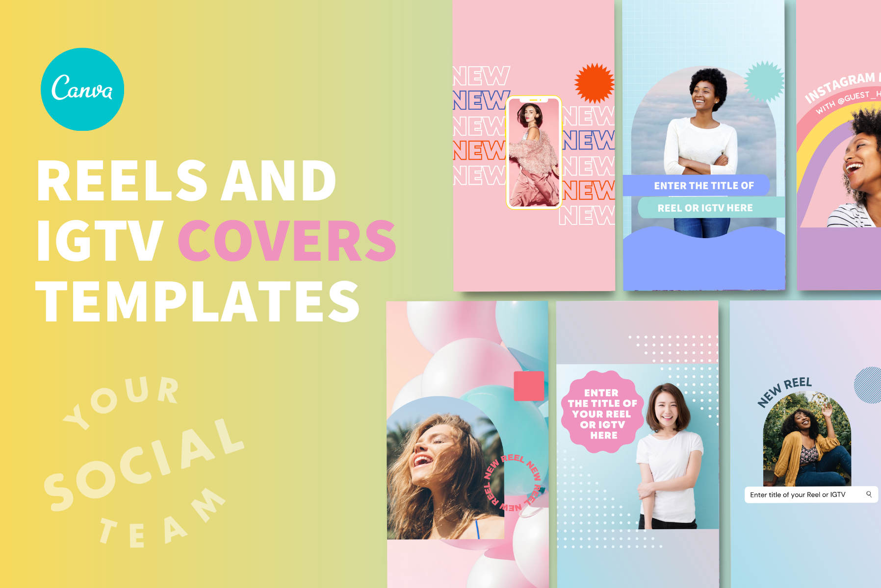
Want to get beautiful covers for Reels and IGTVs without having to worry about all the details? Check out set of Canva templates Cute and Fun covers for Reels
If you want to go beyond just Reels covers, you can also create full Reels with animated graphics, so you don’t have to be on camera for every single Reel
If you want to create Reels for your own business or social media clients without being on camera, or just don’t feel like putting on a bra (no judgement here!), these templates got your back.
These come already animated and timed so all you have to do is follow our text prompts, customize with your brand and colors and use the how-to instructions demo video to record your voice over, add music if you want and post them!
Manu Muraro is the founder of Your Social Team, an Instagram training membership and content shop to help social media managers and Instagram savvy women entrepreneurs to beat the algorithm and grow their organic engagement (yes, even in 2021).
This year she also launched Your Template Club, a Canva Template subscription to provide social media managers and Instagram savvy business owners with content templates designed for engagement in their inbox.
Born and raised in Brazil, Manu moved to the U.S. in 2000 right out of college to work for Cartoon Network, where she made an award winning career in creative and strategy. In 2017, Manu started Your Social Team with the mission of helping women entrepreneurs and social media managers grow engagement and sales through Instagram without the overwhelm.


