
DIY Branding in Canva? Here's How to Make It Look Like You Hired a Designer

How to Download Your Instagram Reels Without the Watermark Using Canva
Most small business owners start their brand the same way.
A logo made late at night. A few colors that felt right in the moment. A font that looked cute on the template and just kind of... stayed. No brand strategy, no designer, no plan. Just a lot of determination and a Canva free account.
That is completely normal. That is how it starts for almost everyone.
But at some point, something starts to feel off. Your Instagram grid looks a little chaotic. Your graphics do not quite match each other. The whole thing feels less polished than your actual offers are.
That is not a sign to scrap everything and start over. It is a sign to tighten up what you already have.
You do not need to spend thousands on a brand refresh to fix this. You need to simplify and systemize. And you can do the whole thing inside Canva.
Here is where to start.
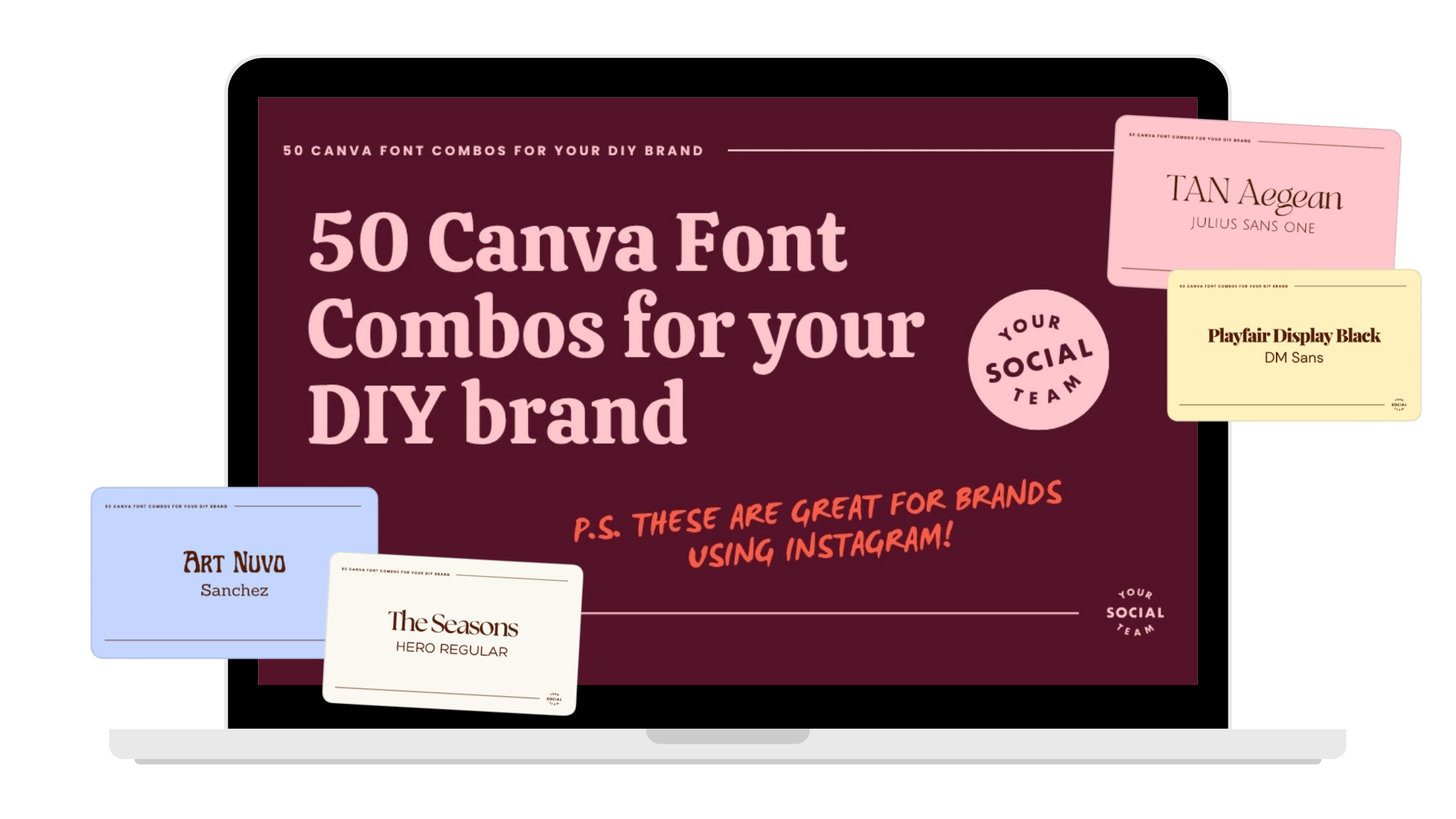
Want to see our favorite Canva fonts?
After creating thousands of Canva templates, designing thousands of Instagram posts, and now as we start to help small business owners create a brand they love, we have quite the collection of Canva fonts for you to dive into!
Is It Okay to DIY Your Branding?
Yes. Completely. You do not need a professional brand identity to run a real business or be taken seriously. Plenty of successful businesses ran on DIY visuals for years before investing in a designer, and some never did.
What matters more than having a professionally designed brand is having a consistent one. Consistency is what makes people recognize you. Recognition is what builds trust. And trust is what converts. So no, you do not need to hire anyone to fix this. You just need a little structure.
The Real Problem with Most DIY Brands
It is not that they look bad. It is that there are too many decisions happening at once.
Too many colors. Too many font combinations. Styles that shift from week to week depending on whatever template felt right that day. Over time, it adds up, and your content starts to feel scattered even if each individual post looks fine on its own.
The fix is not a full overhaul. It is simplifying three things: your colors, your fonts, and your consistency. Do those three things well and your whole brand will feel different.
Start With Your Colors
This is where most DIY brands go sideways, and it is also the easiest thing to clean up.
Stick to six colors. That is it.
Not twelve. Not "a rotating palette depending on the season." Six colors, used consistently, every time. Here is a simple breakdown that works really well:
One very dark base color.
Three main brand colors.
One accent color.
One very light color.
The dark base color is the piece most people skip, and it makes a huge difference. A deep, grounding color — think dark navy, charcoal, or a rich deep brown — makes everything else feel more elevated and intentional. Use it for text overlays, headlines, and contrast backgrounds. Without it, a brand can start to feel washed out or too pastel-heavy.
How to pick better colors inside Canva.
When you open the color picker, most people drag straight to the brightest, most saturated corner of the palette. That is usually where things go wrong.
Slightly muted tones are almost always more cohesive and easier on the eye than fully saturated ones. Instead of going all the way to the brightest version of a color, pull your picker back toward the center just a little. If it looks like a highlighter or you squint slightly when you look at it, it is probably too bright. Avoid rainbow branding.
You can love every color and still not use every color in your brand. Using too many colors makes your content harder to recognize, and recognition is everything. When someone scrolls past your post, you want them to feel it before they even read it. "Oh, this is hers." That only happens when your colors show up the same way every time. Pick a small palette and repeat it often. That is the whole strategy.
Then Fix Your Fonts
If you are not a designer, three fonts is all you need. One for headers, one for subheaders, one for body text. Each one has a job, and they do not overlap.
Your header font. This is your attention-grabber. It needs to be bold, readable on a small phone screen, and easy to understand at a glance. This is not the place for a decorative script or a font with fine details that disappear at small sizes.
Some great options inside Canva: Anton, Recoleta Bold, Sunborn, Brice. Use this font for headlines, hooks on Instagram posts, and titles in your graphics.
Your subheader font. This one supports your header and is where you get to add a little personality. It should still be readable, just a touch softer or more stylized than your header.
Some great options inside Canva: Playfair Display, Libre Baskerville, Lora, Cormorant. Use this for section titles, pull quotes, and slightly smaller callouts.
Your body font. This one should be almost boring. Simple, clean, easy to read without thinking about it. Because if someone has to work to read your text, they will not.
Some great options inside Canva: Open Sans, Montserrat, Raleway, Poppins. Use this for paragraphs, captions inside graphics, and any longer blocks of text. When in doubt, go simpler. Clarity beats cleverness every time.
The Part That Actually Makes It All Work
You can have beautiful colors and great fonts and still have a brand that feels messy. The thing that ties it together is using the same combinations over and over again.
Same color pairings. Same font hierarchy. Same general layout style. Repeated consistently, week after week.
This is where Canva's Brand Kit feature becomes your best friend. Save your colors, your fonts, and your logo inside your Brand Kit and they will be accessible every time you open a new design. No more hunting for the right hex code or guessing which shade of pink you used last time. It is all right there.
Consistency is not about being boring. It is about being recognizable. And recognizable is what converts.
The Mistakes That Keep DIY Brands Looking DIY
A few things to stop doing immediately:
Using too many colors is the fastest way to make your content feel chaotic. If your palette has more than six colors in active rotation, it is time to cut it down.
Choosing fonts that are hard to read on a phone. Beautiful on a desktop does not always mean readable on a 5-inch screen. Test your fonts at the size you actually use them.
Switching styles every week. Even a really good template loses its power if you use a totally different style the next day. Repetition is the point.
Picking trendy over timeless. Trend-driven visuals have a short shelf life. A clean, cohesive brand that holds up for two or three years is always worth more than chasing whatever is popular right now.
need help with your DIY brand?
Get a complete brand identity designed to help you stand out on social, show up consistently and grow your business with confidence. Designed by the team behind Your Template Club and Your Inbox Team, trusted by thousands of small business owners.

Photo: KVC Photography
About Manu Muraro
Manu Muraro is the founder of Your Social Team, a content marketing brand helping small business owners grow through strategic email marketing and Instagram content.
She’s the creator of Your Template Club, one of the first Canva template subscriptions designed for Instagram, and the founder of Your Inbox Team, a weekly email marketing membership that helps entrepreneurs send consistent, high-converting emails in under 15 minutes.
Manu is also the creator of The Reelies Awards, the first award show celebrating Small Business Owners and Creators’ creativity and originality in Instagram Reels.
A former creative strategist at Cartoon Network, Manu brings award-winning experience to everything she creates — from viral Reels to done-for-you content that saves time and drives results.
👉 Follow Manu at Your Social Team on Instagram